



Check out our YouTube video showing the history of the Apple.com website! It has all the images and captions from this page, and is easy on the eyes.
One of the Oldest .com Addresses (1994)
Apple registered apple.com on February 19, 1987, which makes it one of the
earliest .com domains still registered, often listed at number 64.
The World Wide Web did not exist yet, Steve Jobs had already been gone from the company for two years, and for its first years
the address served email rather than a public web presence.
The Internet Archive did not start capturing apple.com until 1996, so the earliest homepage survives only as a reconstruction. Designer
Kevin Fox rebuilt the one below from memory, old NCSA Mosaic screenshots, and a great deal of patience in Photoshop. The six-color logo is enormous and bold, while
the menu is painted onto a slab of textured stone, and one of the five links is labeled Smorgasbord.
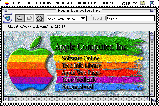
Apple.com as imagined in the NCSA Mosaic browser (1994)
Source: kfury.com
A Company in Transition and Turmoil (1996)
By 1996 Apple was losing more than $800 million a year, and the homepage shows a company arguing rather than selling. The centerpiece
is a contest-winning essay called Why Macintosh computers are better than PCs running Windows 95, sitting beside a yellow starburst
advertising rebates. Navigation is a column of blue orbs. The layout is a table of beveled gray panels, bordered like a control panel,
with the six-color apple tucked into its own little box in the corner.
You can feel the defensiveness in it. This is the front door of a company that has to explain why it still exists.
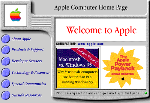
Homepage touting Macintosh superiority over Windows 95 (1996)
Source: arquivo.pt
Banner Ads on the Homepage (1997)
July 1997 was about as low as it got. Gil Amelio had been pushed out five days before this snapshot was taken, Jobs was back as an
advisor and would take the interim CEO job in September, and the homepage was renting space to BMW. That blue rectangle in the middle of
the page is essentially a banner ad. Beside it are promos for the doomed
eMate 300 and a QuickTime VR panorama of the Martian surface, freshly beamed back by
the Pathfinder rover.
Underneath is a two-column wall of news items: preorder Mac OS 8, win a PowerBook 3400, small business advice, Newton networking. It reads
like a company newsletter. And down in the left rail, below the country picker, there is a link called Home Page Archives, which
suggests somebody inside Apple was already thinking like a museum.
The rest of 1997 changed everything. The Think Different campaign launched in
September, and on November 10 Apple opened its
online store, which took in
more than $12 million in its first month of business.
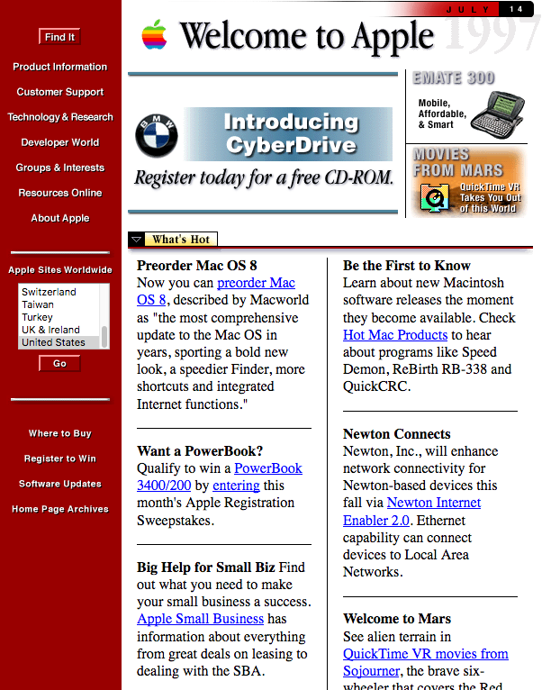
Apple homepage touting the eMate 300 and Mac OS 8 (1997)
Source: archive.org
hello (again) (1998)
This page is from May 8, 1998, two days after Jobs pulled the sheet off the iMac. Almost all of it is white. The word Apple is
set huge in Apple Garamond, the machine greets you with hello (again) in the same handwriting the 1984 Macintosh used, and nothing
else competes for attention.
The three columns below are worth a long look, because they are the entire company strategy printed on one line. Pro. Go. Whoa. A
Power Macintosh for creative professionals, a PowerBook for people who travel, and an iMac for everybody else. Jobs had just reduced
Apple's sprawling product line to a two-by-two grid, and here are three of the four squares. The missing one, a consumer laptop, showed up
the following year as the iBook.
The black bar carrying The Apple Store is the other new arrival. Six months old and given prime real estate on the page.
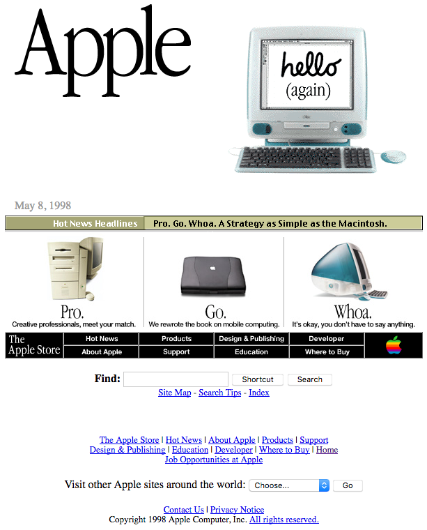
Apple homepage with the iMac (1998)
Source: archive.org
Storefront Unleashed (1999)
By 1999 the homepage had settled into a formula that would last for years: one product photographed on white, one line
of Garamond copy, a timestamp accurate to the minute like a newspaper edition, three smaller stories along the bottom, and
the store bar under those.
The November page announces the slot-loading iMac with two words, Re-birth announcement. Follow that store bar and
you land on the second page below, four Macs in a grid with a price under each one. Look closely at the Buy Me
buttons, glossy candy-colored lozenges with a highlight running across the top.
Aqua, the interface Apple would unveil for Mac OS X a few
months later, was showing up in the marketing before it showed up in the operating system.
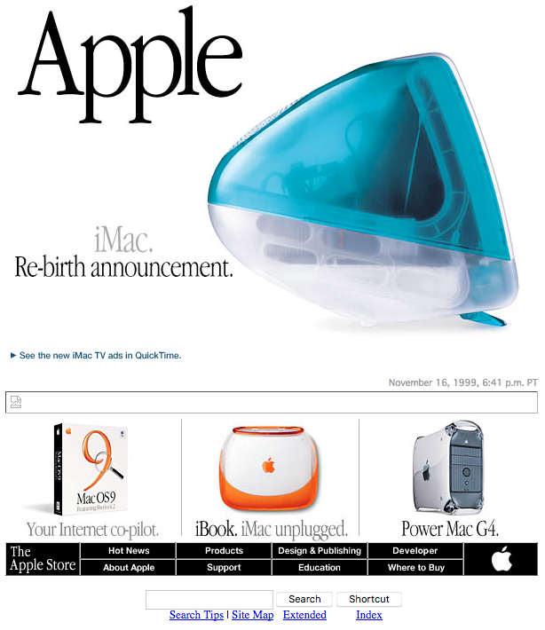
Apple homepage with the slot-loading iMac (1999)
Source: archive.org
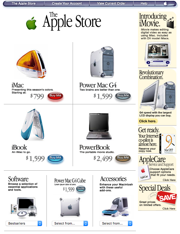
Apple.com store (1999)
Source: archive.org
A month earlier the same layout had carried the Power Mac G4 under the line Move over, speed of light, with a Toy Story 2
QuickTime trailer sitting in the news row underneath. The G4 was fast enough to fall under United States export controls for
supercomputers, and Apple put that in its advertising rather than apologizing for it.
The product page for that machine is the second image below, and it shows where the site was heading. A black strip along the top carrying
Think different., a headline in Garamond, a paragraph of plain English, and then the specifications hidden behind a row of tabs drawn
to look like the tabs on a paper file folder. Apple was already teaching visitors to click on something that pretended to be a physical object.
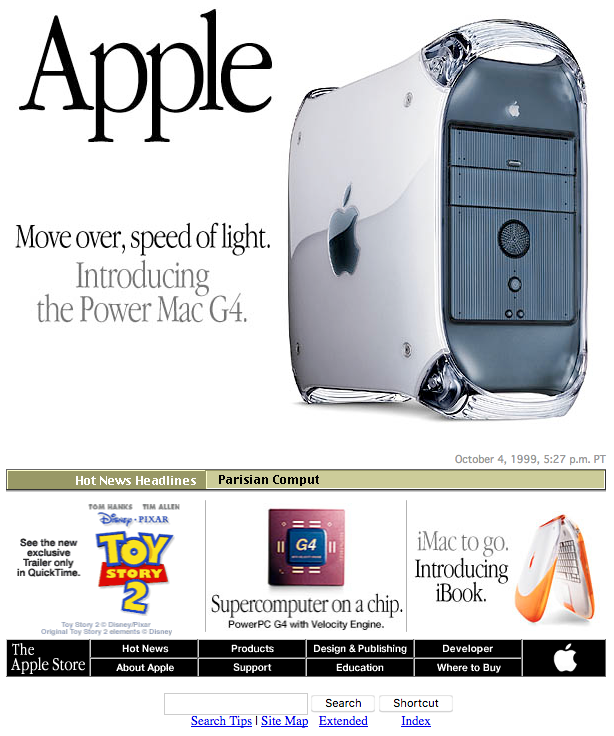
Apple homepage with the Power Mac G4 (1999)
Source: archive.org
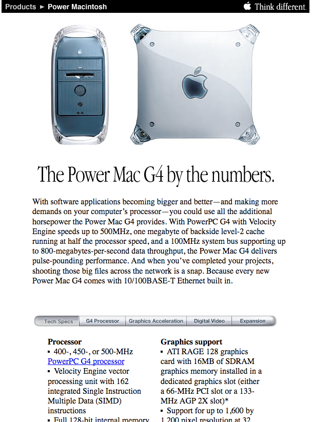
Power Mac G4 product detail page (1999)
Source: archive.org
Tabs Everywhere (2000)
In 2000 the navigation grew tabs of its own. Store, iReview, iTools, iCards, QuickTime, Support, drawn with a soft gradient and a
rounded top edge, with the six-color apple riding on the first one. The website and the operating system had started converging on the same
visual language, and more than a quarter century later the relationship is still visible.
The hero is five iMacs in five colors under two words, Internet expressway. Two of those tabs, iTools and iCards, are services rather
than machines, which is the earliest hint on this page of where Apple's next two decades were going.
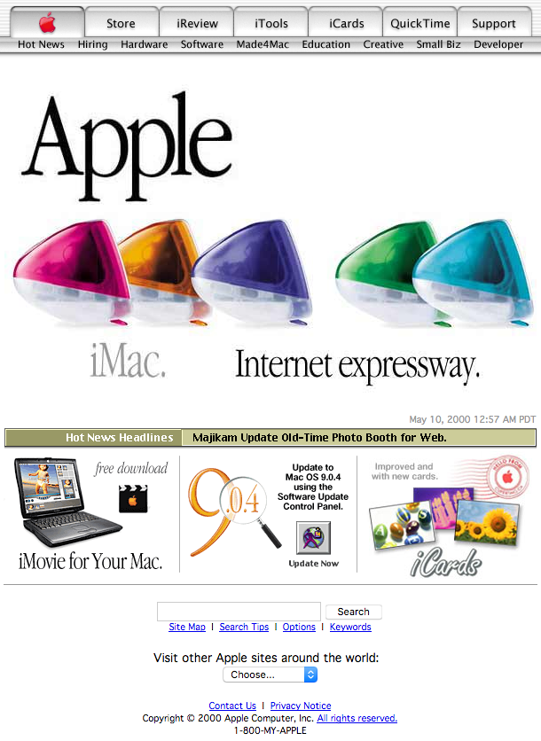
Apple homepage with various iMac colors (2000)
Source: archive.org
The store had grown into a real catalog by then, with a sidebar, a right rail of promotions and a price under everything. The other page below is the one Apple used to sell the public an unfinished operating system. Mac OS X Public Beta shipped on September 13, 2000 for $29.95, and the page asks for feedback in as many words, complete with a link to a feedback forum and a grinning blue Finder icon. If you want that story in full, we have an illustrated history of Mac OS X.
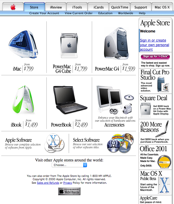
Apple.com store (2000)
Source: archive.org
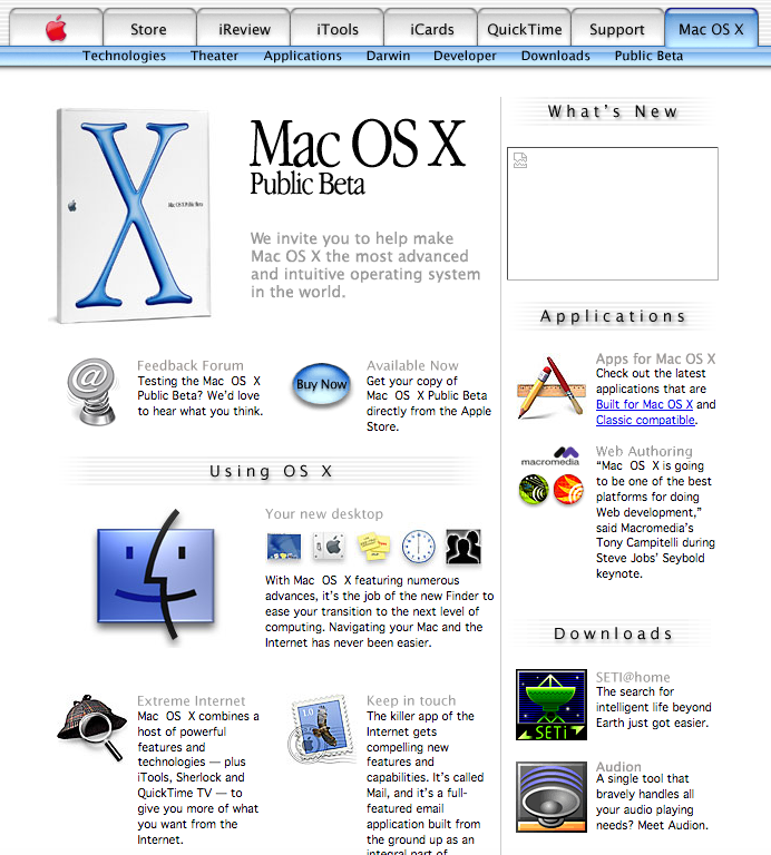
Mac OS X Public Beta section of Apple.com (2000)
Source: archive.org
The Homepage Goes Quiet (2001)
On September 11, 2001, Apple emptied its front page. No products, no news, no store promotion. One sentence set in Garamond, floated in
a great deal of white space, and a link to the American Red Cross underneath it.
Apple would return to some version of this page after later public losses and disasters, and the grammar of it never really changed.
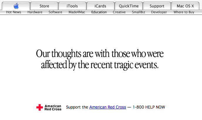
Apple.com after September 11 terror attacks (2001)
Source: archive.org
1,000 Songs in Your Pocket (2001)
Six weeks later the iPod arrived, and the page announcing it is a small masterpiece of restraint. One device, one claim, four supporting
facts, three buttons. Nobody was told how many megabytes five gigabytes was; they were told what a thousand songs felt like.
Two small things date this page beautifully. The six-color apple on the first tab has been replaced with a glassy blue one, and one of the
three buttons at the bottom says sync with iTunes 2. Here is a consumer device designed to plug into a Mac, rather than a Mac itself,
given the whole front page.
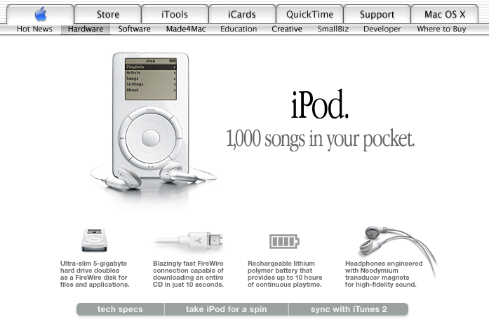
Apple homepage showcasing the iPod (2001)
Source: archive.org
Garamond Gives Way to Myriad (2003)
Something quiet happens between 2001 and 2003. The typography changes. Apple Garamond, the elegant condensed serif that had carried the
brand since the mid eighties, gives way to Myriad, a humanist sans serif. The new iMacs. is set in it, bold and tight, and the page
immediately feels faster and less precious. Myriad stayed on apple.com until 2017, when Apple replaced it with its own San Francisco typeface.
The page itself is two machines side by side with their specifications spelled out underneath, prices included. That was ordinary in 2003
and would have been unthinkable on apple.com five years later. There is also a Switch tab in the navigation, aimed squarely at
Windows owners, and a .Mac tab where iTools used to be.
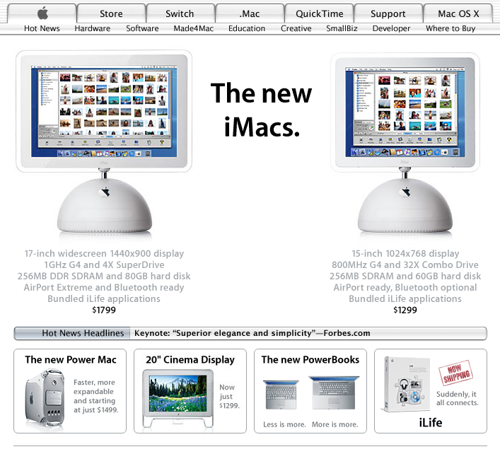
Apple homepage showing the redesigned iMac (2003)
Source: archive.org
The Year iTunes Took Over (2004)
2004 is the year Apple stopped being a computer company on its own front page.
The first image below is the Pepsi promotion that kicked off during the Super Bowl in February. A hundred million free song downloads,
one in three bottle caps a winner, and the iTunes window rising out of a phalanx of soda bottles. The record industry was suing its own
customers, while
Apple was fighting Apple Corps over iTunes, and here it is handing out free music with a soft drink.
The second is U2. The band got its own black iPod and its own homepage, and to hold a portrait of Bono the page went full width and went
dark. That treatment, one enormous image running edge to edge with white type dropped on top, is so ordinary now that it is easy to miss
how strange it looked sitting under a row of gray folder tabs.
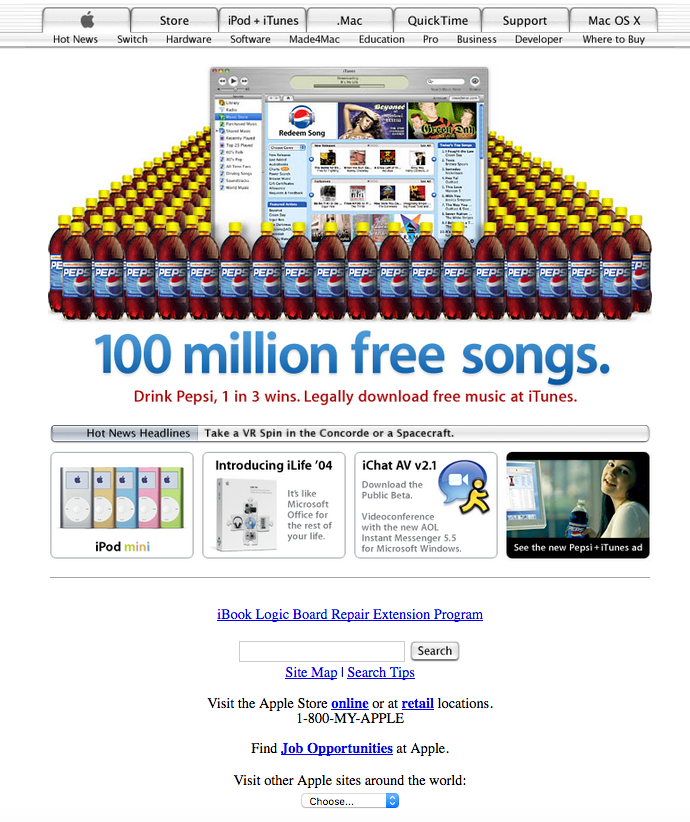
iTunes Pepsi promotion (2004)
Source: archive.org
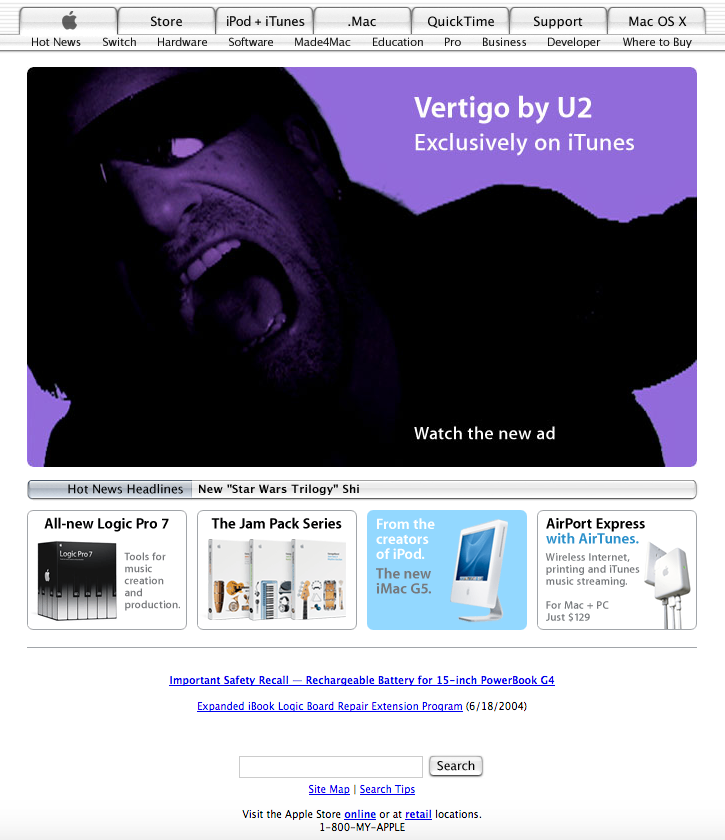
Homepage U2 promotion for Vertigo (2004)
Source: archive.org
Then, at the end of December, the page went quiet again for the Indian Ocean tsunami.
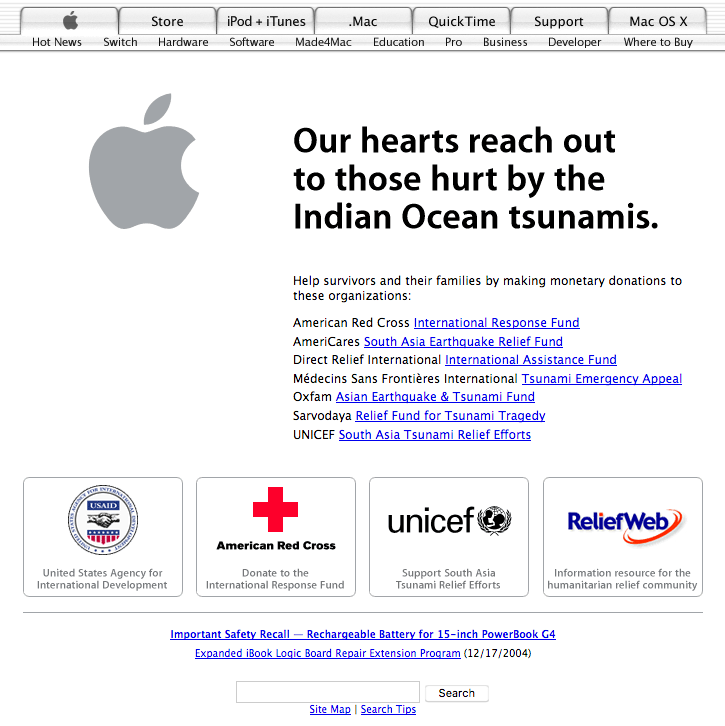
Indian Ocean tsunami assistance (2004)
Source: archive.org
Think Different, One More Time (2005)
The first page below is peak iPod. Two players side by side, prices in gray, and four promo boxes underneath. The third box is the one worth reading: WWDC 2005. Spotlight on innovation. June 6-10, San Francisco. That is the conference where Jobs announced Apple was abandoning PowerPC and moving the entire Mac line to Intel, and the homepage is quietly plugging early registration for it.
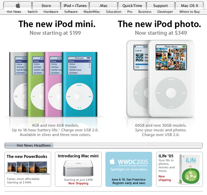
Apple.com homepage with iPod mini and iPod photo (2005)
Source: archive.org
In October, Rosa Parks died, and Apple reached back into its own advertising to say so. The photograph of her on the bus was one of the portraits used in Think Different, and the tribute reproduces the campaign exactly: white apple in the top corner, the two words underneath it, her name and dates in the bottom left, and nothing else on the image at all.
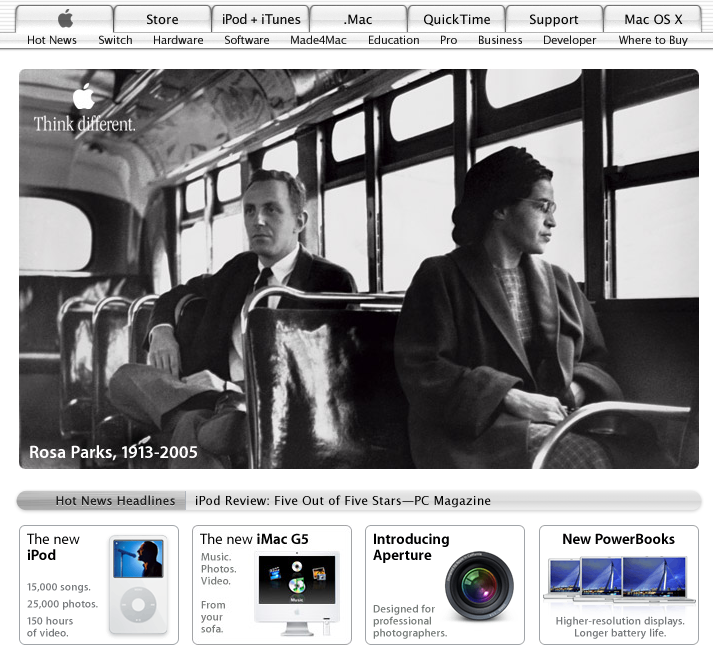
Apple homepage after the passing of Rosa Parks (2005)
Source: archive.org
I'm a Mac (2006)
For much of 2006 the homepage was a stage for two actors. Justin Long and John Hodgman stood on plain white in the
Get a Mac ads, and Apple gave them the whole hero slot, complete with the pause
Hodgman leaves hanging in the air.
The line beside them dates this page harder than anything else on it: QuickTime 7 is required to view the ads. Watching video on the
web in 2006 still meant downloading a plug-in first and hoping for the best.
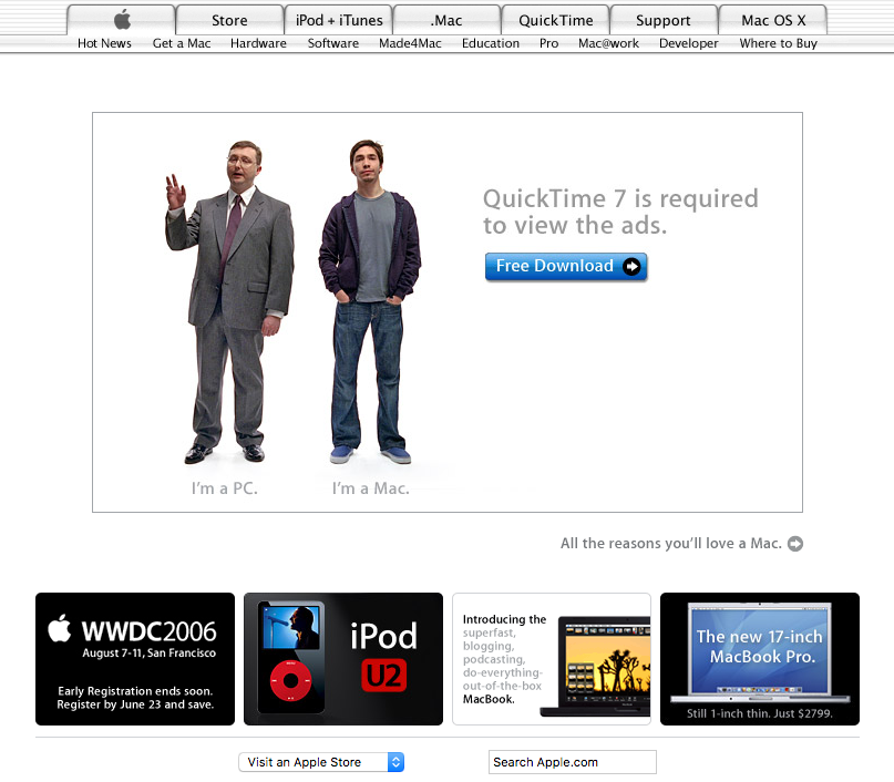
Homepage with the "I'm a Mac, I'm a PC" QuickTime ad (2006)
Source: archive.org
iPhone Launch (2007)
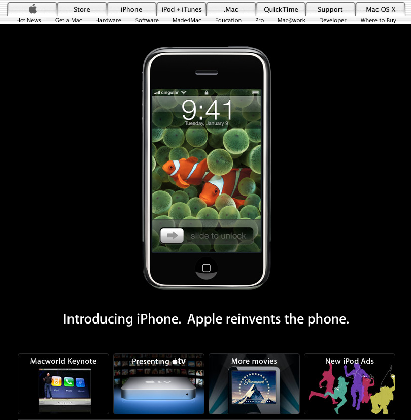
January 9, 2007 was a very large day for this website. Apple announced the iPhone, dropped the word Computer from its legal name,
and turned the front page black. The phone floats in the dark above one sentence. A new tab has appeared in the navigation for a product
nobody could buy for another six months.
The clock on the screen reads 9:41, which is roughly when Jobs actually revealed it on stage, and
the reason many later iPhones
were photographed at that minute. The team had originally set the product shots to 9:42 and moved them back when the
rehearsals kept landing a minute early. Both times survive on this page. Scroll to the July screenshot below and check the status bars.
Apple homepage showing the original iPhone (2007)
Source: archive.org
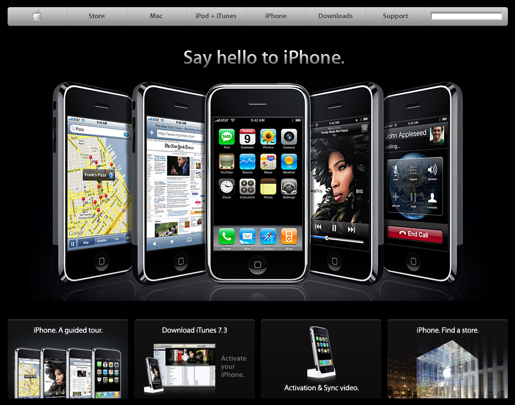
By July the tabs were gone. Seven years of gray file folders were swapped for a single dark glossy bar with a search field on the right,
and the category list was cut back to Store, Mac, iPod + iTunes, iPhone, Downloads and Support. That bar, tweaked and reshaded but never
really replaced, ran the site until 2013.
Five iPhones are fanned out below it showing maps, a newspaper, the home screen, an album and an incoming call from John Appleseed, who has
been Apple's imaginary customer since the days of the Apple II.
Apple.com iPhone showcase with the redesigned navigation bar (2007)
Source: archive.org
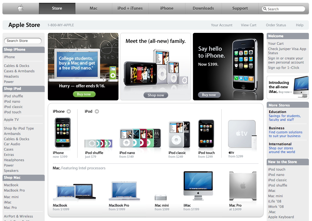
The store got the same navigation. It is dense by modern standards, with a left rail, a right rail, three promo tiles and a price under every thumbnail, but it is recognizably a modern shopping page. Two details fix the date: a back-to-school offer that expires on September 16, and an iPhone listed at $399. Apple had cut the price by $200 barely ten weeks after launch, early buyers were furious, and Jobs wrote an open letter handing every one of them $100 back in store credit.
Apple.com online store (2007)
Source: archive.org
iPhone 3G (2008)
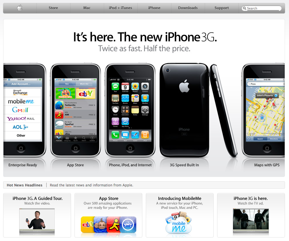
White comes back for the iPhone 3G, and five phones are lined up like specimens, each captioned with one capability: enterprise mail,
the App Store, phone and iPod and internet, 3G, maps with GPS.
The second phone is the one that mattered. The App Store had opened days before this snapshot with around five hundred titles, and the
little grid of icons in the promo box below, eBay and Super Monkey Ball and AIM, is the opening frame of an entire industry.
Apple homepage announcing the iPhone 3G (2008)
Source: archive.org
iPad is Here (2010)
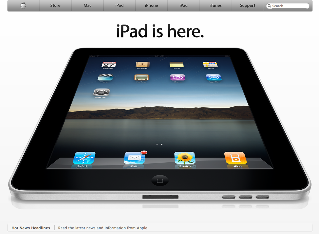
The modern apple.com really starts here. iPad is here. Three words, and then one object tilted into the light, big enough that it
runs off both edges of the browser window. There is no supporting copy above the fold at all, and the news headlines have been demoted to a
thin gray strip at the very bottom.
The iPhone 4 page does the same trick inverted. Black instead of white, two phones mirrored against each other so you can see the glass on
one side and the steel band on the other, and This changes everything. Again. in between. The only interface on the whole page is
three video links along the bottom.
Apple homepage announcing the original iPad (2010)
Source: archive.org

Homepage iPhone 4 promotion (2010)
Source: archive.org
The Last of the Dense Pages (2011)
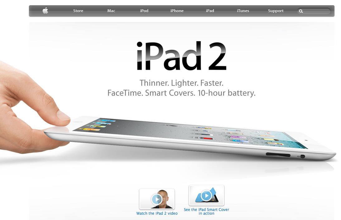
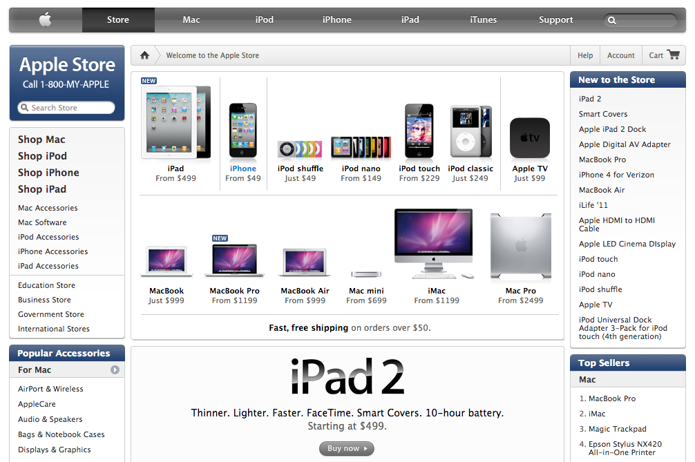
The iPad 2 homepage is a hand, a tablet and six short sentences. The store page below it is the exact opposite, and it is close to the
last time apple.com ever looked like this: a sidebar of shopping categories, a grid of thumbnails with prices, a Top Sellers list, a
New to the Store list, and free shipping over $50 set in bold. There is an Epson all-in-one printer sitting in the Mac bestsellers.
Within four years the standalone store would be gone, and shopping had been pulled much closer to the product pages.
Apple homepage with the iPad 2 (2011)
Source: archive.org
Apple.com store (2011)
Source: archive.org
Steve Jobs, 1955-2011
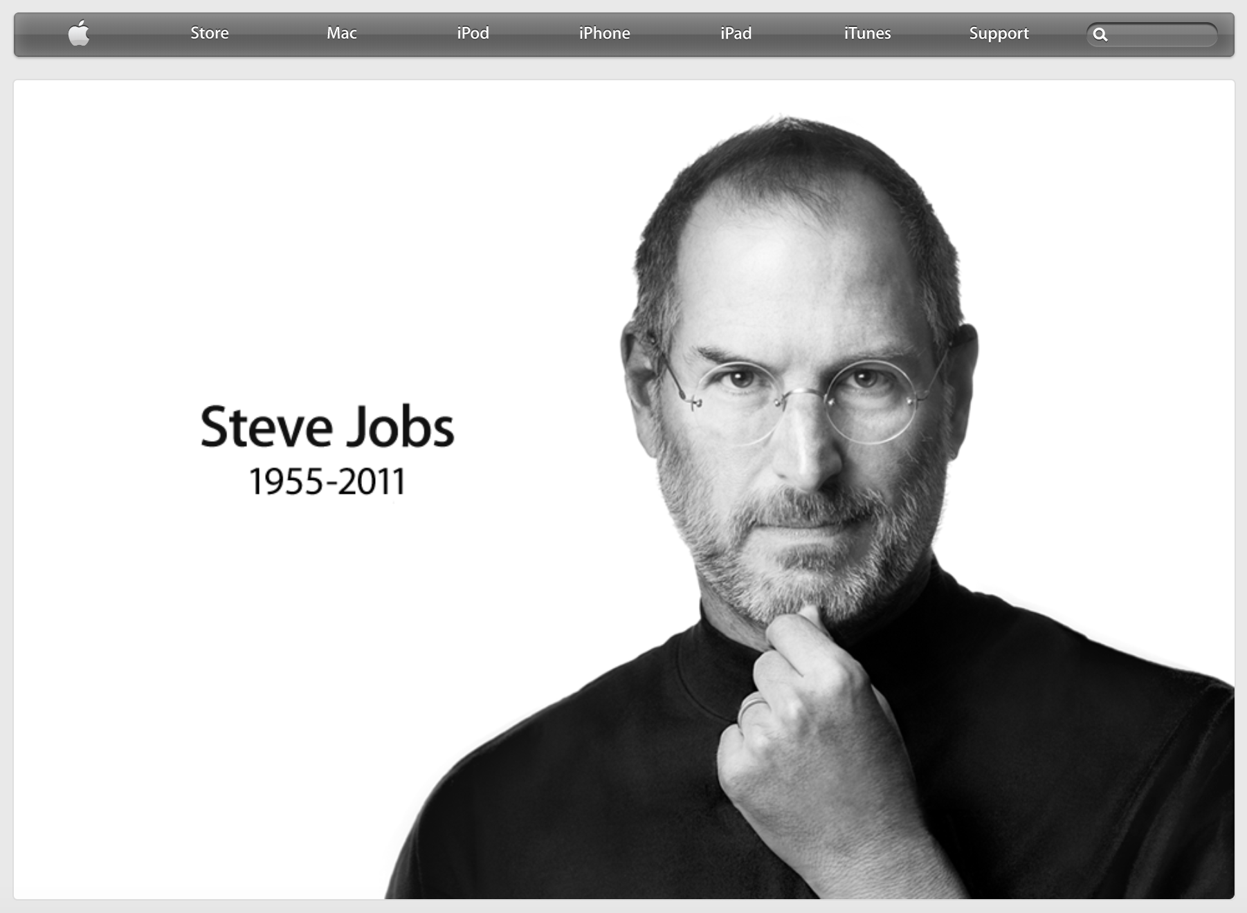
On October 5, 2011, apple.com became a photograph. Albert Watson's portrait, a name, two dates, and nothing else on the page. Clicking
the image led to a short message and an email address, [email protected], which filled up with condolences from all over the world.
Flashbacks to September 11th and Rosa Parks.
Homepage after the passing of Steve Jobs (2011)
Source: archive.org
Thin Type, Flat Chrome (2013)
The iPhone 5 page is Apple's typography at its very thinnest. The product name is set in a light weight at an enormous size, the tagline
below it is lighter and grayer still, and the whole thing floats in air. iOS 7 landed later the same year and stripped the gloss out of the
operating system, and the website followed within months. The glassy navigation bar flattened, the drop shadows went, and the gradients
thinned down to nothing.
In December the page went quiet for Nelson Mandela.
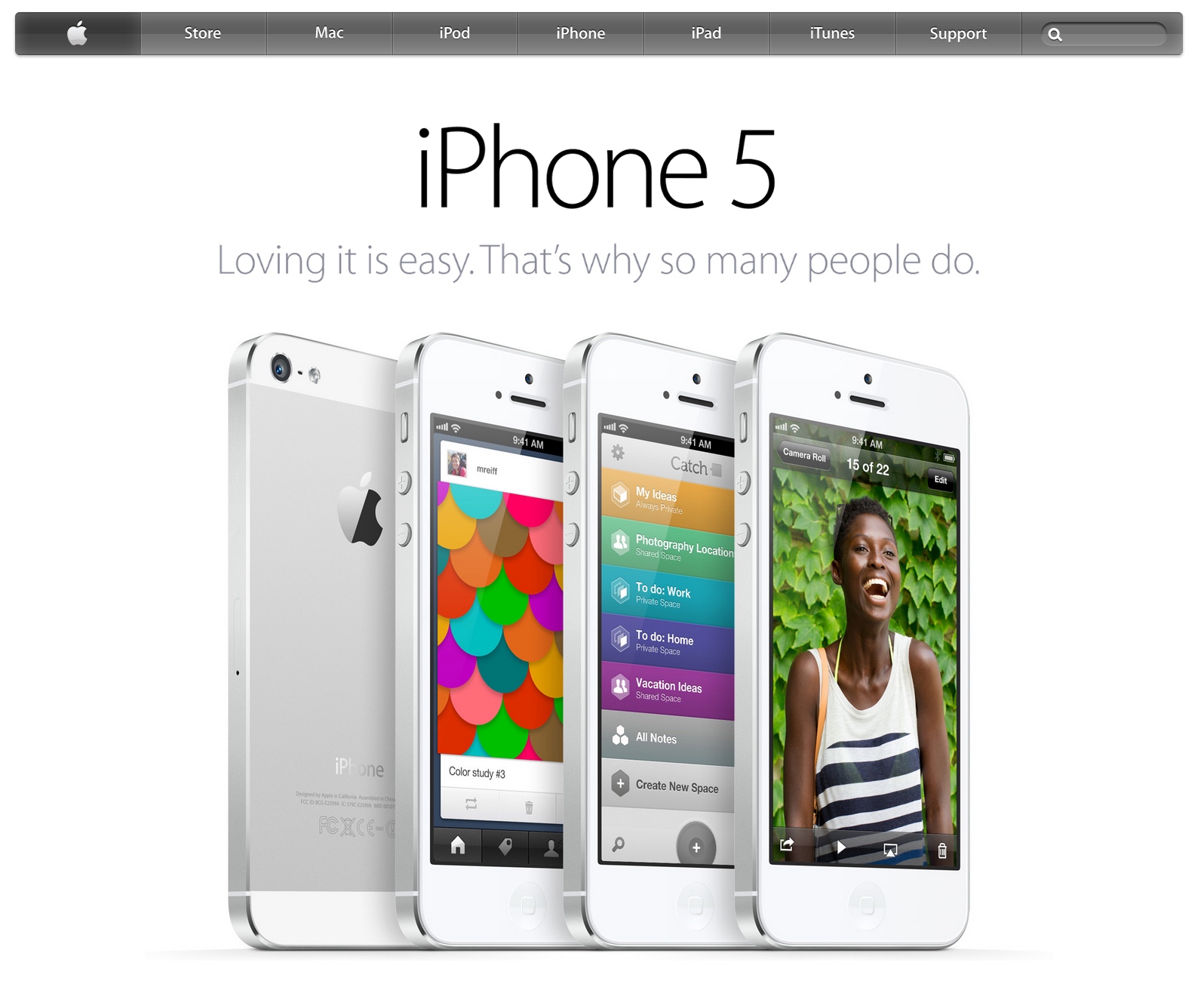
Apple homepage showing the iPhone 5 (2013)
Source: archive.org
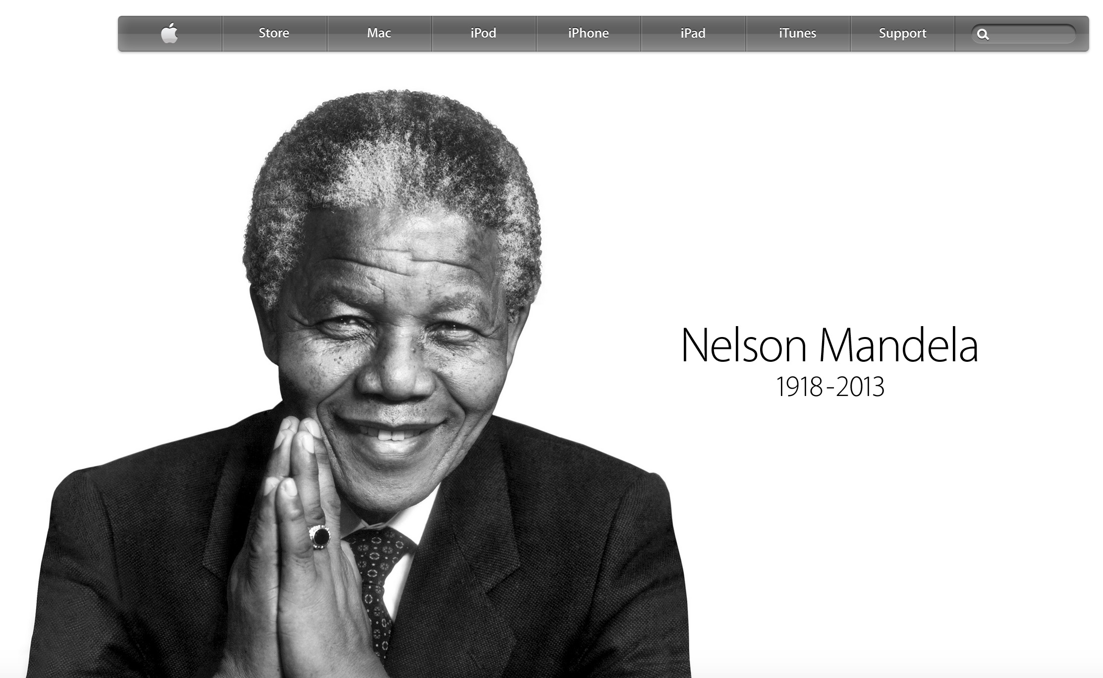
Homepage after the death of Nelson Mandela (2013)
Source: archive.org
Happy Birthday, Mac (2014)
On January 24, 2014 the Macintosh turned thirty, and Apple built one of its finest homepages for it. The numeral 30 with an apple standing in for the zero, a short column of sentences with a lot of air between them, and then the pairing that does all the work: a 1984 Macintosh drawing a balloon in MacPaint, one bit deep and 512 pixels wide, sitting next to a photograph of a wall of real balloons on a modern iMac display. Thirty years of screens in a single row. If that machine on the left is your sort of thing, we have the full design history of classic Mac OS too.
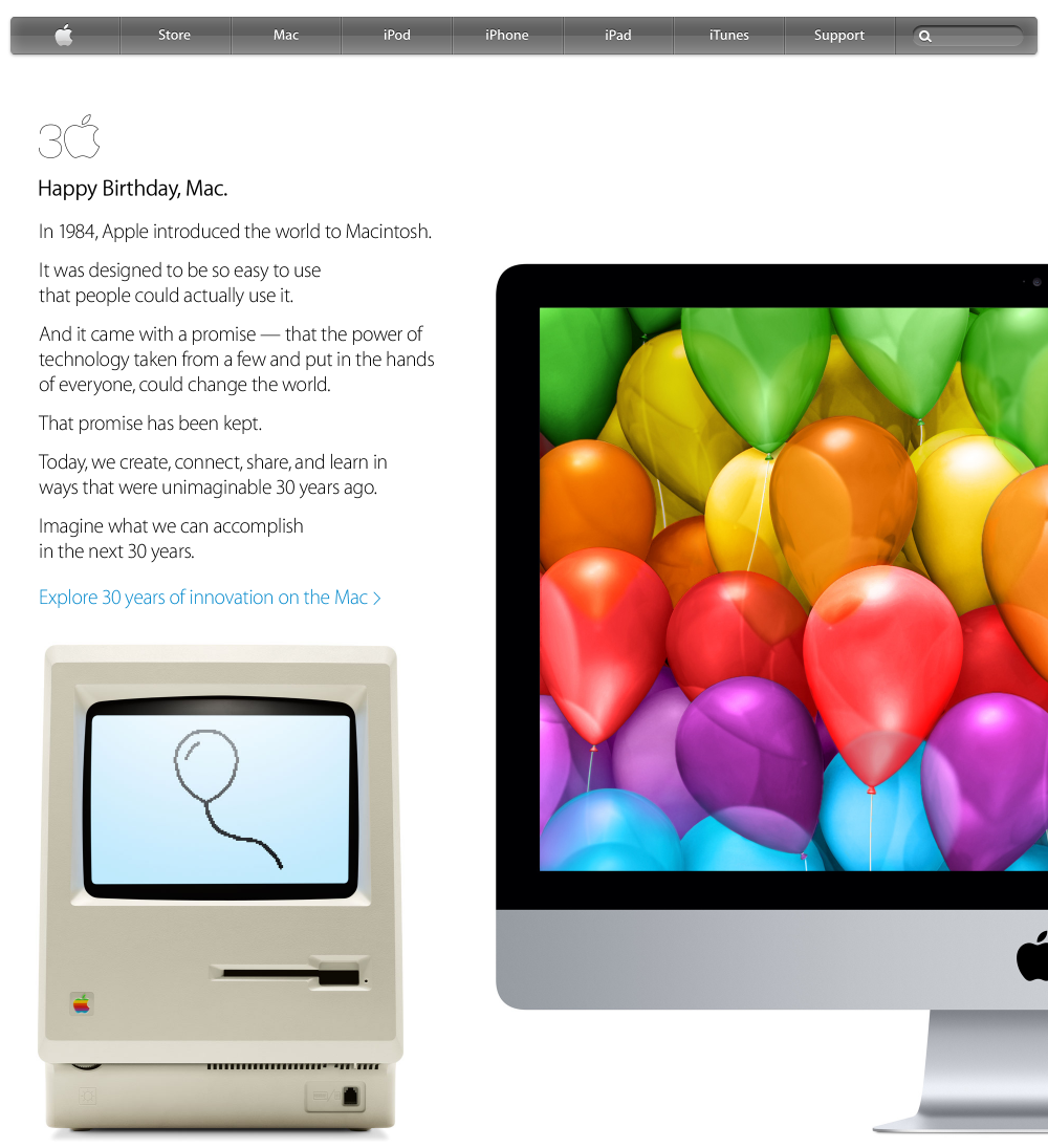
Homepage celebration of the 30 year Mac anniversary (2014)
Source: archive.org
Later that year the navigation bar dissolved into the photograph behind it. This is the September event page, with Tim Cook lit on a dark stage and the links resting directly on the image with no bar around them at all. A Watch tab has appeared for a product that would not go on sale for another seven months, and iPod is still hanging on beside it.
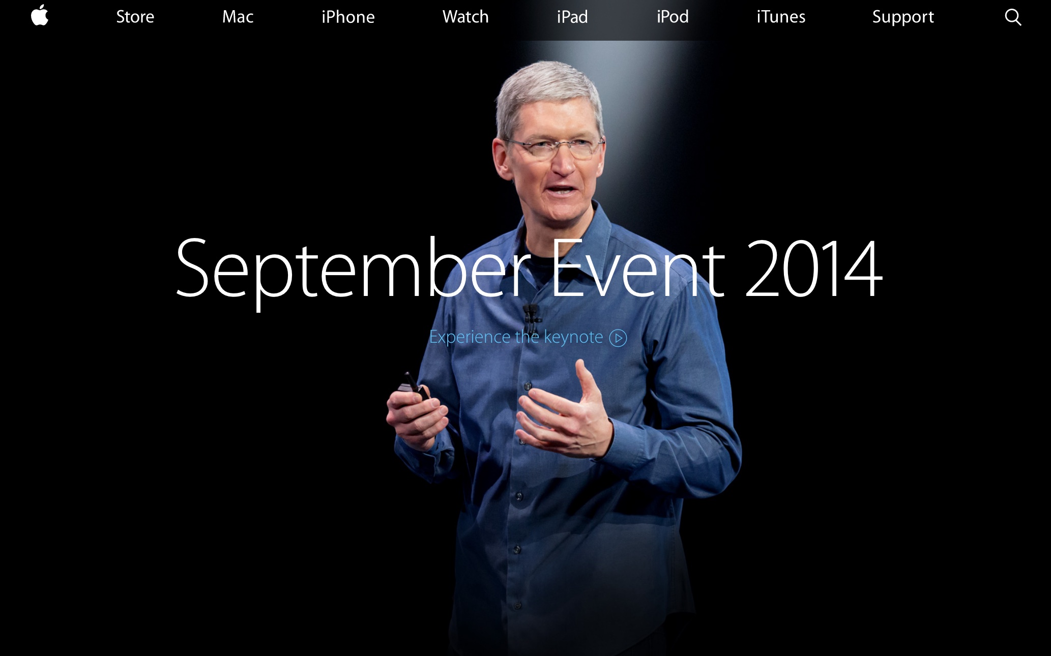
Homepage with Apple CEO Tim Cook (2014)
Source: archive.org
The Watch, the World Gallery, and the End of the Store Tab (2015)
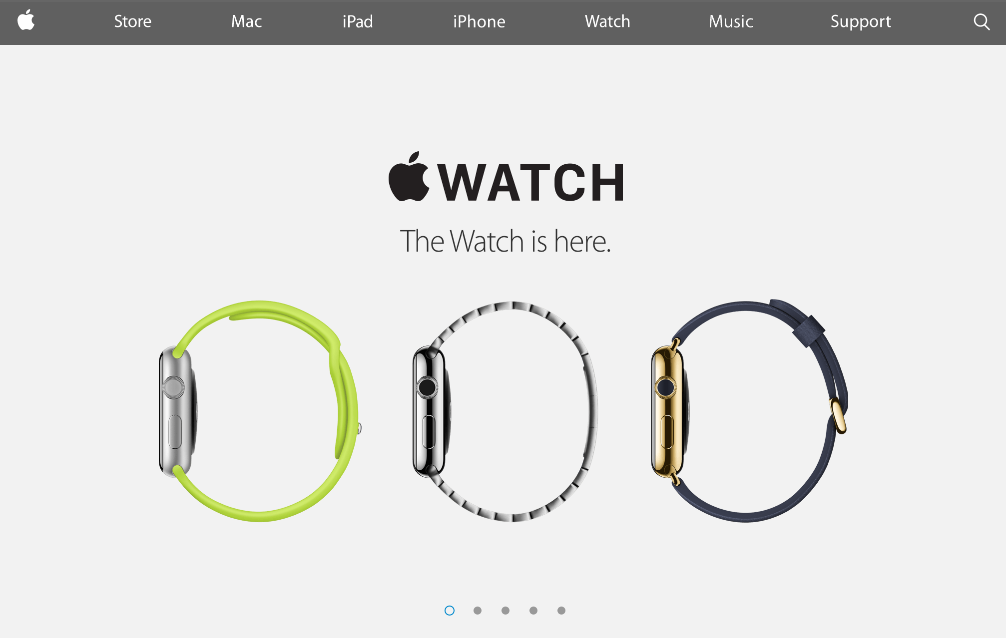
The Apple Watch page photographs three watches from the side as three open rings, in green rubber, steel and gold, floating on pale
gray. The dots underneath mean the hero is now a carousel, so the homepage had quietly become several homepages taking turns.
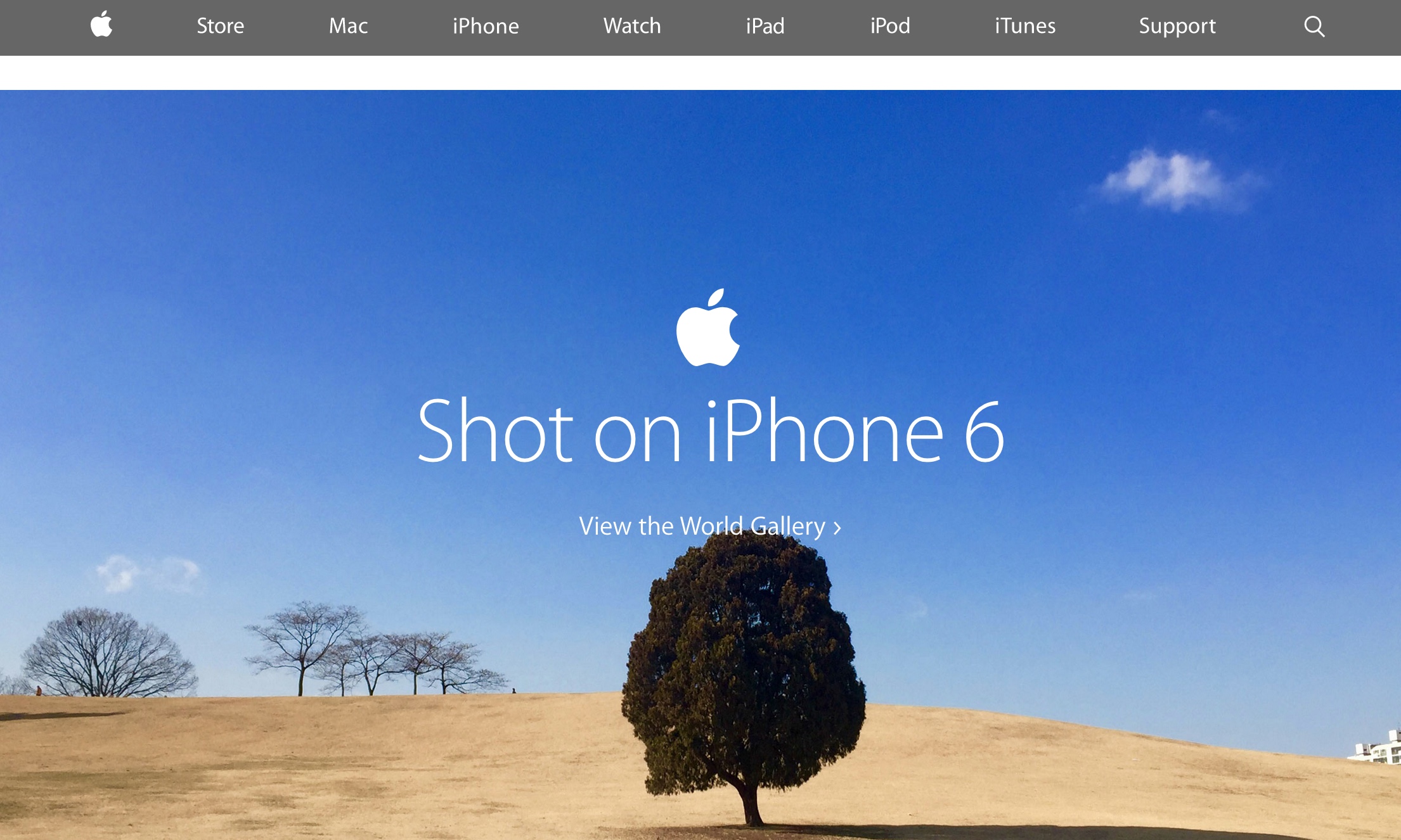
The other page hands the entire viewport to a tree. Shot on iPhone 6 drew from
photographs by seventy-seven people in seventy cities across twenty-four countries, put them on billboards and on the front page of apple.com,
and won an Outdoor Lions Grand Prix at Cannes for its trouble. The campaign is still running.
There is one more thing hiding in both of these screenshots. The navigation still says Store. On August 6, 2015 Apple
deleted that tab,
retired store.apple.com, and moved the Buy buttons onto the product pages themselves. A shopping bag icon took its place at the far right,
and it has been there ever since. Notice too that iPod has gone and Music has arrived.
Homepage touting the Apple Watch (2015)
Source: archive.org
Homepage with a photo taken on the iPhone 6 (2015)
Source: archive.org
Black Again (2016-2017)
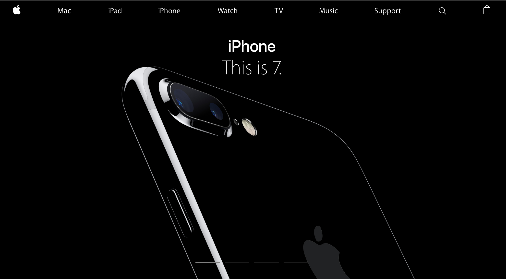
Jet black paint deserved a black page. This is 7. sits in thin white type over the corner of an iPhone 7 Plus that is mostly
shadow, lit just enough along one edge to show the shape. It is closer to a car advertisement than to anything Apple put on this site in
the nineties.
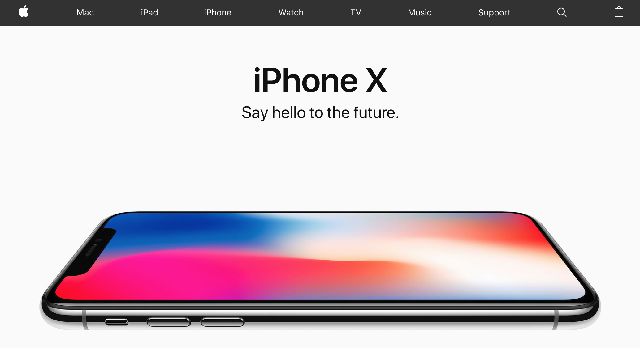
The iPhone X page the following year goes the other way, back to near-white, with the phone laid flat and the wallpaper doing all the
shouting. Both pages carry the navigation Apple would use for years: Mac, iPad, iPhone, Watch, TV, Music, Support, a magnifying glass and a bag.
Apple homepage showing the iPhone 7 (2016)
Source: archive.org
Apple homepage showing the iPhone X (2017)
Source: archive.org
A Homepage You Scroll (2018-2019)
The last structural change on this page is the one nobody announced. The homepage stopped being a page and became a stack.
Each product gets a full-height panel with a headline, a line of copy, and two blue links reading Learn more and Buy. You
scroll from one to the next. The 2019 screenshot catches something else that had crept in: the first thing on the page is not a product
name, it is a monthly payment. iPhone XR from $18.99/mo. or $449. Apple was leading with financing terms and a trade-in offer.
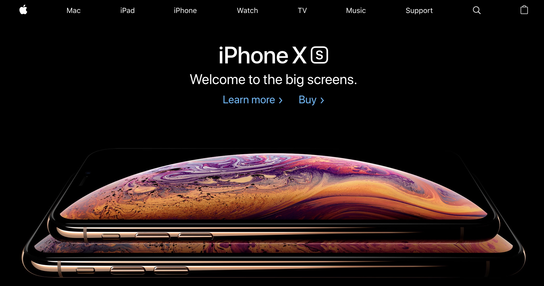
Apple homepage showing the iPhone XS (2018)
Source: archive.org
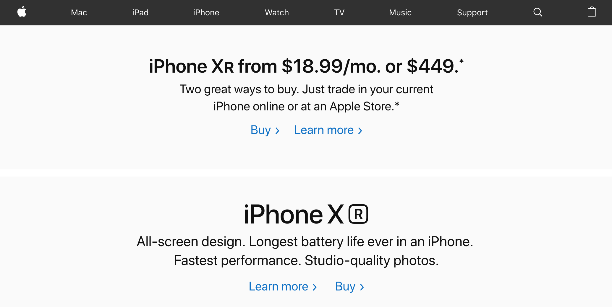
Apple homepage showing the iPhone XR promotion (2019)
Source: archive.org
Good Trouble (2020)
Congressman John Lewis died on July 17, 2020, and Apple gave him the front page. Black and white portrait, one quotation set large
in the company's own typeface, a name and two dates underneath.
Put this next to the Rosa Parks page from fifteen years earlier and the continuity is remarkable. Same instinct, same restraint, same
willingness to hand the most valuable piece of retail space on the internet to somebody who never sold a computer.
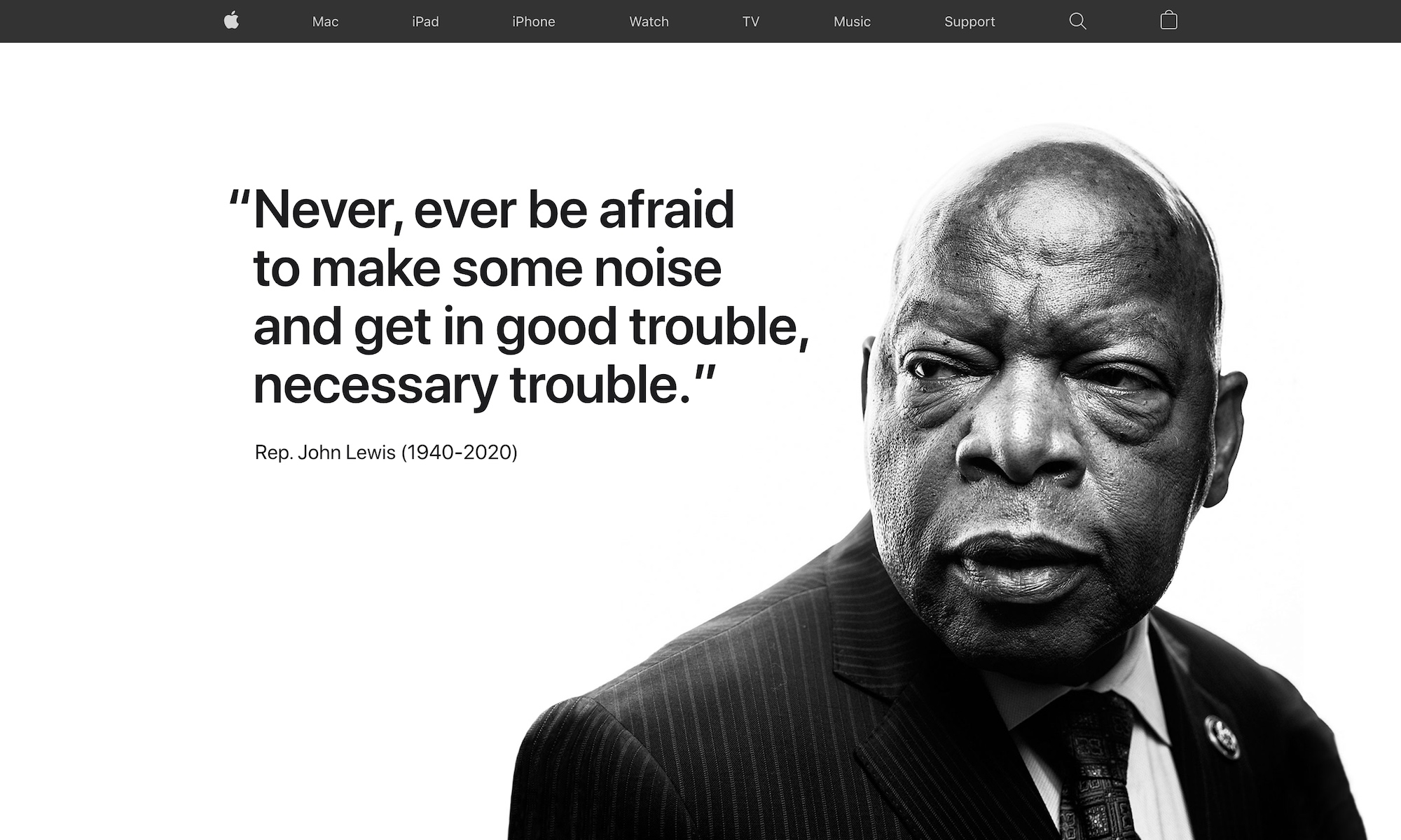
Apple homepage paying tribute to civil rights leader John Lewis (2020)
Source: Version Museum
More from Version Museum
 More from Version Museum
Classic Mac OS
Continue with Apple's original graphical platform. View the exhibitPopular exhibits
Please help support our museum hosting costs by making a small donation -- buy us a coffee! Thank you so much!
 Buy us a coffee!
Scroll up to the top.